Address
304 North Cardinal St.
Dorchester Center, MA 02124
Work Hours
Monday to Friday: 7AM - 7PM
Weekend: 10AM - 5PM
Address
304 North Cardinal St.
Dorchester Center, MA 02124
Work Hours
Monday to Friday: 7AM - 7PM
Weekend: 10AM - 5PM
Choosing colors for brand identity isn’t just about looks—it’s a strategic move that influences customer perception and conversion. Unlock the psychology and tech that can guide your color choices effectively.
Choosing colors for brand identity isn’t about personal taste—it’s about emotional resonance. As a solopreneur, freelancer, or startup founder, your brand must emotionally connect with your audience within seconds. Color psychology taps into humans’ unconscious associations with certain hues, setting the tone for how your business is perceived.
Studies show that up to 90% of initial judgments about products are based on color alone. Colors evoke a psychological response before a single word is read or product is explored:
Your brand color palette should consistently express your values and story across all platforms—logos, websites, SaaS interface design, packaging, and even email templates. For instance, Slack integrates vibrant, friendly colors to match its playful brand voice, while IBM sticks to reliable blue tones for a trustworthy enterprise feel.
Colors act like instant messengers of your brand’s identity. Understanding color psychology means you’ll be equipped to choose a palette that builds trust and communicates your purpose before users even read your tagline.
If you’ve ever debated endlessly between shades of blue or felt paralyzed by color combos, you’re not alone. Choosing colors for brand identity may feel subjective, but there’s real science behind what works and why.
Research shows different colors stimulate different parts of the brain. When we see color, it’s processed in the brain’s occipital lobe, immediately triggering hormonal responses tied to emotions and memories. This explains why certain colors can make users feel calm, energized, or secure within milliseconds.
For example:
While red is powerful in Western countries (conveying urgency or love), it symbolizes luck in China or mourning in South Africa. Be mindful of your target markets; color preferences can vary dramatically across cultures, demographics, and industries.
Successful brand identities use complementary or analogous color schemes grounded in color theory. This ensures aesthetic cohesion and visual appeal. For instance:
Use tools like color wheels or palettes generated from digital design platforms to identify scientifically pleasing color combinations.
There’s structure behind every well-chosen color scheme. By embracing biology, psychology, and visual theory, your brand can achieve both emotional impact and visual cohesion—setting the foundation for recognition and retention.
The crucial bridge between meaning and appearance lies in alignment. Choosing colors for brand identity isn’t just visual—it’s deeply strategic. Your color palette should reflect your mission, personality, and audience expectations. Otherwise, you risk sending mixed messages.
Before picking any shades, answer these foundational questions:
You can use color to express specific traits. Here’s a practical mapping:
If you’re a B2B SaaS founder, blue and gray tones may align better with professionalism and reliability. Lifestyle brands targeting Gen Z might benefit from bright, vibrant palettes with pop-culture relevance. Align not with personal preferences but with user expectations and behavior.
Headspace, a wellness-focused app, uses orange—symbolizing warmth and happiness—to express tranquility and optimism. The palette aligns perfectly with its purpose: mindfulness and emotional wellness.
Your audience should feel like your color choices “get” them. When brand values and color harmonize, it creates a visual language your audience instinctively understands—and trusts.
Even with good intentions, choosing colors for brand identity can go wrong fast if you fall into common pitfalls. Too many startups and small businesses lose visual coherence—or worse, erode user trust—because of avoidable missteps.
If your color palette lacks contrast or has poor readability, your website or product becomes difficult—or impossible—for colorblind or low-vision users to engage with. Tools like the WebAIM contrast checker can help ensure compliance and inclusive design.
Overcomplicating your palette with more than 3-5 main colors dilutes your message. Brand memorability comes from visual simplicity. Think of brands like Twitter (one primary blue) or Dropbox (two-tone blue and gray). The fewer the colors, the stronger the association.
Trendy shades may look fresh today but feel outdated tomorrow. Neon gradients, pastel waves, or high-saturation tones often trip brands into rebrands down the road. Instead, base your palette on timeless, strategic alignment with your values and audience—not design fads.
Brands often fail to standardize colors across platforms. This leads to a disconnect between digital, print, and in-person brand experiences. Solve this by creating a centralized brand style guide with exact HEX, RGB, and CMYK values for consistency everywhere.
While it’s tempting to pick colors you personally love, your brand colors should resonate with your audience, not your mood board. Test your palettes with target users or through A/B digital experiments if possible.
Avoiding these common mistakes will not only protect your aesthetic but improve brand clarity, relevance, and performance across all channels.
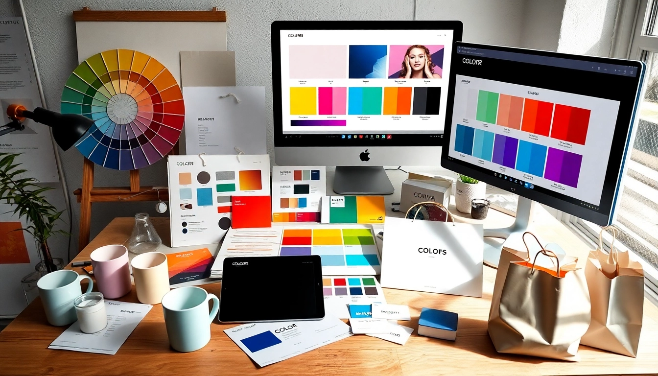
Choosing colors for brand identity doesn’t have to mean spending days shuffling swatches. Thanks to modern SaaS tools, you can define, test, and implement a professional color strategy without hiring a designer.
A user-friendly color scheme generator that lets you explore palettes with one click. Lock in specific colors and generate harmonious combos instantly. Great for those needing a quick but reliable starting point.
Ideal for advanced designers or branding teams. You can explore color theory rules like triadic or monochromatic schemes. It also enables extracting palettes from images—perfect when working with mood boards.
Upload any image and Canva extracts colors to build instant palettes. This is particularly useful for freelancers developing branding inspired by product photography or nature shots.
This free platform offers a curated gallery of trending and professional palettes—perfect for inspiration when visual creativity is running low.
An AI-based tool that learns your color preferences and designs personalized palettes based on them. Over time, Khroma improves its suggestions as you interact with its system—an excellent option for startups committed to cohesive long-term branding.
For accessibility-focused color planning, Stark is a plugin (for Figma, Adobe XD, and Sketch) that checks contrast ratios and ensures your palette is inclusive to all users.
Combine tools for a more comprehensive experience. For example, start your palette with Coolors.co, refine with Adobe Color, test user-friendliness with Stark, and share your finalized brand kit via Canva.
The right SaaS tools empower smart decision-making, saving you time and enhancing your strategic vision. By incorporating these applications into your workflow, color selection becomes a structured, data-supported part of your branding strategy.
In the fast-moving digital world, attention is short—but color endures. When done right, choosing colors for brand identity becomes a stealthy form of storytelling—one that attracts users, builds emotional trust, and drives loyalty with a glance.
You now grasp not just the emotional importance of color, but the science behind it, the alignment with your values, what mistakes to avoid, and which SaaS tools will make the journey smoother. This is more than a visual task—it’s a strategic decision that influences first impressions, conversions, and long-term brand engagement.
Whether you’re launching your freelance business, scaling a SaaS platform, or advising brands as a consultant, remember: Color isn’t decoration. It’s communication. Use it wisely—and your brand won’t just be seen; it will be remembered.